Final Audio Story

Mindfully Practical is an imaginary company which offers various stress management practices for professionals who want a format that is less spiritual than typical yoga studios. For my audio story, I decided to design a single-person podcast that Mindfully Practical would share with their clients/customers.

First Draft

I chose a format that I have heard on other podcasts and You-Tube channels in which a list is presented. My idea was that this would provide a natural way to incorporate background music as I transition between each numbered item. It has a beginning introduction, middle technique list, and quick ending comment. I used the Smart Recorder app on my cell phone to record a continuous piece of me reciting the entire podcast script.

The first challenge was that my voice has never recorded well, sounding much softer than it does in person. I have to consciously lower my pitch in order to sound clear. However, that clarity is mitigated because I have a difficult time not running words together when talking on a script. I also have a difficult time pronouncing words that I can normally say without a problem. (On my recording it is noticeable that I have a hard time with “visualization”.) I was happy to discover that I could set the audio type to Dialogue on my voice over and select Enhance Voice: Female. This greatly improved the problem of my voice recording too softly and made the recording clearer.

I was able to use the Razor tool to break my single recording into clips. I then cut out unnatural pauses and filler words.

For the background music, I found free music licensed under a creative commons license on the website freemusicarchive.org. I chose to use “There Is Always A Reason” by artist Borrtex. On a second track in my multitrack file, I used the razor tool to cut a piece of music which I made louder for an introduction and transition piece between the numbers. I used a fade in and out on these segments. Then I added a third track in which I placed the remaining segments of the music to start and end with my talking. I reduced the volume to negative 22 so that it would not drown out my voice.

Revision Process

My classmates and instructor gave me a lot of great suggestions. Following their advice, I softened the fade in and out of the background music at the beginning and end of the segment. Then I increased the volume on the segments of the voice over by +5 and decreased the volume of the background music during these segments to -25. This made my voice stand out more while still having a background behind it. Finally, I followed a classmate’s suggestion and paired down some information in the last two techniques until all three technique segments were approximately equal in length. This made it sound much more concise and polished.

There were some items that I had wanted to adjust that I was unable to. I had really hoped to re-record my introduction to remove static noise and my saying the word visualization to sound more natural. However, because I lower my pitch when recording, I wasn’t sure how to duplicate the same tone of voice. I tried three re-recordings of the word and each time the difference in the pitch of my voice was noticeably different. This sounded more unusual than my difficulty pronouncing the word so I left the original clip in there.

Also, it was noted that my choice of background music was a bit sad for the nature of the topic. I had a difficult time identifying a different instrumental piece that was still soothing. In the end I decided to stay with the song that I had.

Final Product

My final audio story product is something that I would not have thought that I could do. I have always disliked my voice when recorded and so always avoided it. I am very happy with my audio story just for personal benefit of sounding better! I found the Audition program to be easy to work with and I am pleased with the result.

Draft Audio Story

The audio assignment has been the most stressful for me so far. In the end, I had imagined it to be more of a problem for me than it actually was and placed myself under an unnecessary time crunch.

The main area I was avoiding is that my voice has never recorded well, sounding much softer than it does in person. I have to consciously lower my pitch in order to sound clear. However, that clarity is mitigated because I have a difficult time not running words together when talking on a script. I also have a difficult time pronouncing words that I can normally say without a problem. (On my recording it is noticeable that I have a hard time with “visualization”.)

The best solution would have been to record someone else reading my script, but I mistakenly avoided the assignment until that was not an option.

My original idea was to do an interview story in which I presented the imaginary company Mindfully Practical as a new enterprise. I had a difficult time scripting the interview, so at the last minute I changed it to be an interview of someone from the company’s target market, to be used in a presentation to show investors that there is a demand for Mindfully Practical. A friend of mine played the role of a local business owner and I was the interviewer. I love my friend, but with both of our speaking difficulties this did not sound much like a real interview. My final decision was to do a single-person podcast that Mindfully Practical would share with their clients/customers. This meant that I had to record myself.

I chose a format that I have heard on other podcasts and You-Tube channels in which a list is presented. My idea was that this would provide a natural way to incorporate background music as I transition between each numbered item. It has a beginning introduction, middle technique list, and very quick ending comment as I was running out of time.

I used the Smart Recorder app on my cell phone to record a continuous piece of me reciting the entire podcast script. I then used the Razor tool to cut out some unnatural pauses and filler words. Sometimes the recording sounds as though I cut the segment too early but it is actually the odd way in which I ended the sentence (such as when I say “chin up”).

For the background music, I found free music licensed under a creative commons license on the website freemusicarchive.org. I chose to use “There Is Always A Reason” by artist Borrtex.

On a second track in my multi-track file, I used the razor tool to cut a piece of music which I made louder for an introduction and transition piece between the numbers. I used a fade in and out on these segments. Then I added a third track in which I placed the remaining segments of the music to start and end with my talking. I reduced the volume to negative 22 so that it would not drown out my voice.

Lastly, I was happy to discover that I could select the recording type as “Dialogue” on the clips of my talking and then select Enhance Voice: Female. This greatly improved the problem of my voice recording too softly and made the recording much clearer.

Overall, I think that my draft turned out pretty good considering how nervous I was for it.

Final Logo

The Company

Mindfully Practical is an imaginary company which offers various stress management practices for professionals who want a format that is less spiritual than typical yoga studios.

First Draft

Logo

First I researched recognized symbols for both mindfulness and practicality. Most were difficult to tie together – such as a lotus flower for mindfulness and a dollar sign for practicality. At last I came across a perfect icon online. A white infinity symbol (mindfulness) inside a dark profile of a head (practical).

To make this my own, I decided to add to the infinity symbol by making it the base for a person meditating as I have seen on tattoos before. I created the figure using simple text Glyphs. Inside of the head profile, the complexity was a problem for scale. I decided to scratch the head profile and just use a circle as background.

Because studies have shown that blue is the most effective color for logos, and dark shades subconsciously represent trust and responsibility (very practical), I chose navy for the circle. To create a contrast without being glaring, I chose the opposing color on the color wheel for figure, gold. I added interest with highlights. Lastly, I included the name of the company wrapped around the circle, in a practical Roman font.

Revision Process

The draft was a great foundation but unpolished. The font most needed improvement. My classmates gave excellent suggestions such choosing a font with uniform characters and to raise the base of the Y for an even spacing from the circle. One suggested that a more sans serif font would fit mindfulness better and could still look practical. I found that capital letters appeared more finished and even.

Although wrapped around it, the name seemed disconnected from the logo. I decided to anchor it by using an outline ring as a background to the letters. I created a thick stroke around the middle circle. It seemed like it needed to be gold to offset the background, which then required a second stroke of blue for letter background, which then required an outer stroke of gold to tie it in. The result created a look of a seal which seemed professional.

In the new middle ring of the logo, the letters for the name didn’t stand out much. I changed the font to Impact which is thick and heavy – immediately improving the appearance.

I spent lots of time trying to figure out how to make the letters wrap evenly. No matter how many adjustments I made to the Arc effect, it just didn’t look right. So many logos wrap lettering in a circle – there had to be an efficient way to do it. A quick Google search produced a huge number of results that all stated one must use the Type On A Path tool. I attempted this and found wrapping the letters to be quick and easy. They space out evenly and look correct.

Having the different rings allowed me to use two shades of blue – a darker one for the middle to contrast the gold, and a softer one for the outer ring which is still visible with the navy outlined words. My instructor had suggested using a softer color which would fit better with meditation.

One classmate suggested adjusting the highlights on the meditating figure to look like a single beam to resemble real metal. Adjusting the gradient positions made a large improvement. I also changed the highlight from white to a warm yellow which looked more natural on the gold. I added the same effect to the gold rings.

The new rings solved another problem for me – my draft logo did not have an inverse which would work on a dark background. With the rings, it now worked on any background light or dark.

Final Product

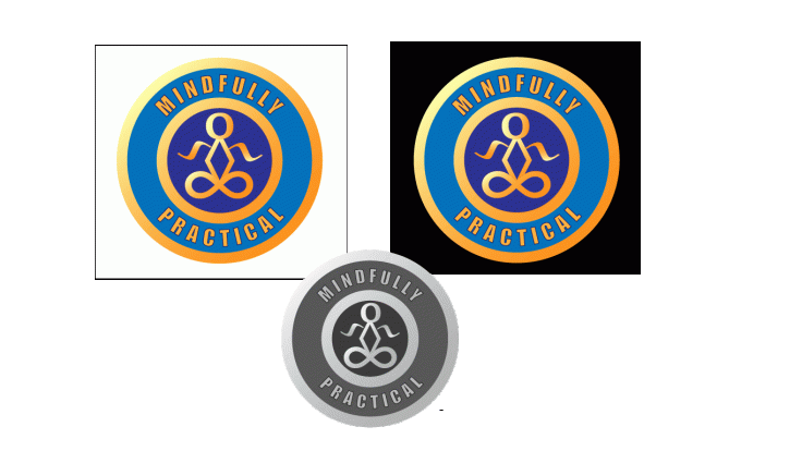
The focal point of the logo is a figure which is both simple and immediately identifiable as a person meditating. It is clear when large or small. The message is strengthened by the boldest color, which is a soothing soft blue to represent mindfulness. Trustworthiness is subconsciously associated with the darker shade of blue at the center. The other aspect of the company, practicality, is conveyed through the readable font which is clear even when the logo is quite small. The overall shape of the logo is a circle which invokes “official” as it resembles a seal, enhanced by the double ring. The accent color is gold, which on a color wheel is opposite of the blue, so it provides high contrast without glaring. Gold is emphasized with a shine that has a subtle resemblance to metal and enhances the “official” feel. The coloring of the logo is appropriate on either a light or dark background. It also retains its professionalism when printed in grayscale.

Final-Logo

Draft Logo

For this assignment, I decided to create a logo for the imaginary company that I developed earlier in this course. The imaginary company is called Mindfully Practical. The goal of the company is to share methods of finding balance for professionals who need a more logical approach than they find at most yoga studios and similar establishments.

I started by researching recognized symbols for both mindfulness and practicality. I found many symbols that were difficult to tie together – such as a lotus flower for mindfulness and a dollar sign for practicality. Many of these symbols did not actually match the company.

The target market of the company are professionals who feel that other mindfulness offerings are too spiritual or ungrounded for them. The lotus flower is specifically linked to Buddhism and may give the impression that the company is the same as those other kinds. The common symbols for practically do not match either – the dollar sign obviously gives the wrong impression.

At last I found something perfect. I came across this icon online. The white infinity symbol inside of the head profile immediately makes me think of both mindfulness and practicality. Yay!

But unfortunately, I struggled to come up with an original design that was sufficiently unique form this one.

My next decision was to add to the infinity symbol inside of the head. I have seen tattoos before where the infinity symbol was used as the base for a meditating person. This inspired me to draw a meditating person out of various symbols using text Glyphs.

Next I created a large head profile that was angular but recognizable as a head. I made this using the Elipse and Rectangle tools along with the delete and add anchor point tools. My meditating person symbol was originally placed inside of the head profile.

This created a new problem as it greatly limited the scale-ability of my design. When it was scaled down to be small, the symbol inside the head became cluttered. I decided to scratch the head profile idea and use a simple circle around the meditating person. I used the Elipse tool to make an even circle and arranged it in the back. The logo can be scaled large or small and still be identifiable as a meditating person.

I chose to make the circle blue as it is a calming color believed to subconsciously inspire trust and reliability. Navy is also seen as a very practical color and is used often in professional settings. To offset the circle background, I chose the contrasting color of golden orange for the meditating person symbol. Blue and orange are complimentary colors so the symbol clearly stands out without glaring. To add a little more flair to the symbol, I used a gradient fill in different pieces of the symbol to create highlights.

Lastly I chose a practical font to display the company name around the logo. I used the effect “Warp: Arc” to make it wrap around the circle.

Final Graphic Design Project

For this assignment, I created a graphic design product for the imaginary company, Mindfully Practical, which I had developed earlier in class. The goal of the imaginary company is to share methods of finding balance for professionals who need a more logical approach. I chose to make an event flyer which would advertise a lunch seminar in which stress management methods would be shared. The idea was inspired by seminars that I have attended which are jointly hosted by the Corvallis Chamber of Commerce and Big River Restaurant.

DRAFT PROCESS

My initial draft looked much different from the final product. I had a difficult time envisioning a proper layout and so I focused on which techniques from the Photoshop Tutorials lesson I could incorporate. Essentially I designed it by a backdoor approach, letting the tools I wanted to try determine the format instead of my supposed message.

Mainly I focused on creating cutouts which I struggled to execute smoothly. I did this using both the pen tool to make an actual cutout and use of blending options targeted at a specific background color. I also used blending techniques to create a glow which I used to fade out “before” images of myself as a stressed professional. These were placed around a bolder “after” image in an attempt to draw the eye in and create a continuation movement of “before” and “after”. Next I used a cutout of rocks to convey a sense of balance and calm. The original image is by Ralf Kunze, who offers it under a Creative Commons license on Pixabay.com for commercial use and remix. Lastly, I arranged the event details in text around the rocks in a blocked closure format.

For more detail on my original process, please see my initial blog post here.

While this first draft had good elements, I admit that it was unpolished. My classmates and professor provided me with targeted feedback which gave me a lot of ideas for a better design.  By focusing more on the message than the technique, I was able to apply the principles in a more appropriate way.

REVISION PROCESS

In the end, I only kept two elements from my original design. I maintained my font selections as I felt they conveyed my meaning as well as font-type could. I also kept the idea of using smaller and faded out images of the participants looking stressed as “before” photos. This was the only way I could think of to show without words that the seminar is related to stress problems.

Many of my classmates noted that they liked the soothing lavender color of the background so I originally wanted to keep that. I did lighten the color so that there would be more visible contrast from the text. However the professional photos I had seemed out of place with the purple backdrop so I adjusted to a pale blue for more unity.

In my first draft I had aspired to use original photos which ended up looking amateurish. For my final product I determined to use professional photos licensed for commercial use. I followed my classmates’ advice and looked for more diversity of people and pictures that would visually explain the event.

I found a series of professionally done photos of business people, one of which showed them in a café which was perfect to convey my venue. There were photos of them looking happy and one of each that I could reasonably use to portray as “stressed”. This series of photos is offered for commercial use and remix through a Creative Commons license on Pixabay.com under the username rawpixel.

I also searched for a picture of someone in professional attire eating what could be lunch in a café. Based on the feedback, I needed to cut the wording down on my flyer. However, in my real-life experiences it has become a deciding factor for me if a lunch option is clearly included. I wanted that to be explicit and found a good image to convey it. The image is offered for commercial use and remix under a Creative Commons license on Pixabay.com under the username LuckyLife11.

My professor suggested that I bring the text at the bottom together in one piece, following the Gestalt Theory of proximity. Once it was in one block, a chose a centered alignment since I had used that for the header and one classmate pointed out that a unified alignment would look more polished.

As one classmate suggested, I incorporated the Rule of Threes using three distinct sections (top, middle, and bottom), three navy accent rows, and three images per row.

FINAL PRODUCT

My final flyer looks far more sophisticated than the draft. While I acknowledge that there are still many areas for improvement (it looks more like a textbook cover than a poster), I do feel that I made a lot of progress. I appreciate the help of my classmates, look forward to learning new skills in the class, and will continue to study more on my own.

Draft Graphic Design Project

My first task was to decide what type of product would be appropriate for my topic (an imaginary company called Mindfully Practical). The goal of the imaginary company is to share methods of finding balance for professionals who need a more logical approach. An advertisement for a seminar where some methods would be shared was the most appropriate.

In real life, I attend a monthly seminar hosted by the Corvallis Chamber of Commerce which is presented at a local restaurant with lunch provided. This inspired the format for my imaginary seminar.  The advertisement is for a fake event, so I also made up an imaginary restaurant, address, phone number and email.

I wanted the advertisement to be clean and to convey a sense of balance that would be gained from attending. For a clean layout, I was inspired by the poster in this link – an advertisement for an event with makeup artist Sam Fine in Atlanta, Georgia which was hosted by Haute Travels.

I chose a navy blue color scheme because the color is linked to structure, professionalism, and trust. Since the seminar is about mindfulness, I tried to incorporate visual balance in the layout. I mixed a practical and easy to read font with one that is more relaxed.

The image of the balanced rocks perfectly fit the sense of calm that I wanted to convey. The original image is by Ralf Kunze, who offers it under a Creative Commons license on Pixabay.com for commercial use and remix.

Lastly, I had to combine all of these elements into one graphic design product. First I used the Place Embedded function to bring the three images into one file.

On the images of myself, the main technique that I utilized was use of the Pen tool to make Paths, followed by use of the New Layer Via Copy function to create cutouts from the images. Then I used a combination of the blending techniques of Inner Glow and Outer Glow. This allowed me to create a faded look on the images of a “stressed” me, with the image of the “relaxed” me popping out in the foreground.

The image of the rocks had too fine of details for me to effectively use the Pen tool to make a cutout. At first this was a significant challenge. I was still able to create the cutout by adjusting the blending option to focus on the color grey (specifically blending out where grey was not), then using the Eraser tool in a small size (7 pixels) to clear out any remaining background from the original image.

Overall, I am happy with my product for a first draft and feel that I successfully used the tools learned in the class tutorials.


Create a free website or blog at WordPress.com.

Up ↑

Design a site like this with WordPress.com
Get started