The Company
Mindfully Practical is an imaginary company which offers various stress management practices for professionals who want a format that is less spiritual than typical yoga studios.
First Draft

First I researched recognized symbols for both mindfulness and practicality. Most were difficult to tie together – such as a lotus flower for mindfulness and a dollar sign for practicality. At last I came across a perfect icon online. A white infinity symbol (mindfulness) inside a dark profile of a head (practical).
To make this my own, I decided to add to the infinity symbol by making it the base for a person meditating as I have seen on tattoos before. I created the figure using simple text Glyphs. Inside of the head profile, the complexity was a problem for scale. I decided to scratch the head profile and just use a circle as background.
Because studies have shown that blue is the most effective color for logos, and dark shades subconsciously represent trust and responsibility (very practical), I chose navy for the circle. To create a contrast without being glaring, I chose the opposing color on the color wheel for figure, gold. I added interest with highlights. Lastly, I included the name of the company wrapped around the circle, in a practical Roman font.
Revision Process
The draft was a great foundation but unpolished. The font most needed improvement. My classmates gave excellent suggestions such choosing a font with uniform characters and to raise the base of the Y for an even spacing from the circle. One suggested that a more sans serif font would fit mindfulness better and could still look practical. I found that capital letters appeared more finished and even.
Although wrapped around it, the name seemed disconnected from the logo. I decided to anchor it by using an outline ring as a background to the letters. I created a thick stroke around the middle circle. It seemed like it needed to be gold to offset the background, which then required a second stroke of blue for letter background, which then required an outer stroke of gold to tie it in. The result created a look of a seal which seemed professional.
In the new middle ring of the logo, the letters for the name didn’t stand out much. I changed the font to Impact which is thick and heavy – immediately improving the appearance.
I spent lots of time trying to figure out how to make the letters wrap evenly. No matter how many adjustments I made to the Arc effect, it just didn’t look right. So many logos wrap lettering in a circle – there had to be an efficient way to do it. A quick Google search produced a huge number of results that all stated one must use the Type On A Path tool. I attempted this and found wrapping the letters to be quick and easy. They space out evenly and look correct.
Having the different rings allowed me to use two shades of blue – a darker one for the middle to contrast the gold, and a softer one for the outer ring which is still visible with the navy outlined words. My instructor had suggested using a softer color which would fit better with meditation.
One classmate suggested adjusting the highlights on the meditating figure to look like a single beam to resemble real metal. Adjusting the gradient positions made a large improvement. I also changed the highlight from white to a warm yellow which looked more natural on the gold. I added the same effect to the gold rings.
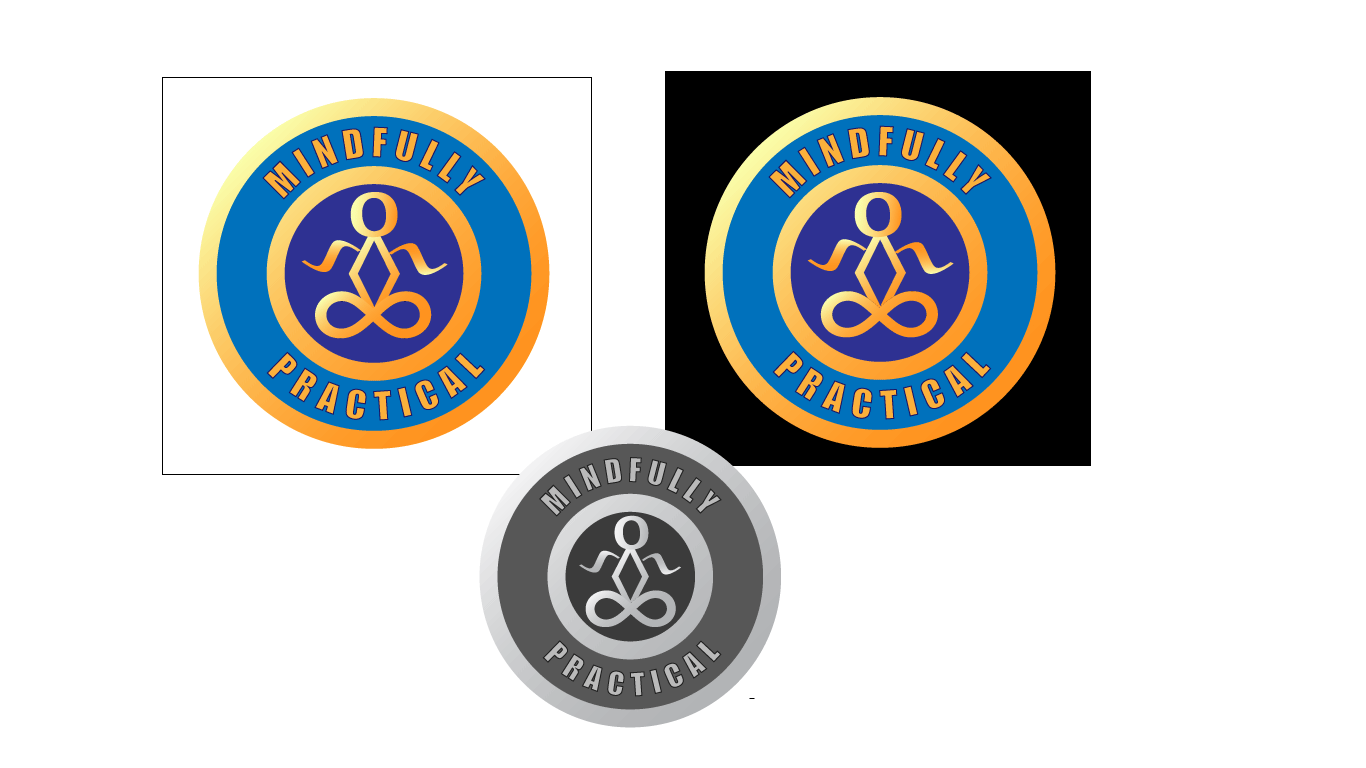
The new rings solved another problem for me – my draft logo did not have an inverse which would work on a dark background. With the rings, it now worked on any background light or dark.
Final Product
The focal point of the logo is a figure which is both simple and immediately identifiable as a person meditating. It is clear when large or small. The message is strengthened by the boldest color, which is a soothing soft blue to represent mindfulness. Trustworthiness is subconsciously associated with the darker shade of blue at the center. The other aspect of the company, practicality, is conveyed through the readable font which is clear even when the logo is quite small. The overall shape of the logo is a circle which invokes “official” as it resembles a seal, enhanced by the double ring. The accent color is gold, which on a color wheel is opposite of the blue, so it provides high contrast without glaring. Gold is emphasized with a shine that has a subtle resemblance to metal and enhances the “official” feel. The coloring of the logo is appropriate on either a light or dark background. It also retains its professionalism when printed in grayscale.


Leave a comment